
Introduction
When designing a Dashboard, the first decision you need to make is its size. A poorly sized Dashboard can, for example, lead to excessive scrollbars within one page. Our target is to minimize the scrollbars on the user's screen, while still providing ample space.
Example
Creating a Kepion Dashboard is akin to creating a website. Most websites have a fixed width, with white space filling in both sides if the browser is wider than the width, as shown below.
When the browser size is narrower than the fixed width, users will normally see a horizontal scrollbar. Let's cover four steps to ensure your Dashboard size is optimized.
Step 1: Set the fixed width to the smallest screen size
Our default dashboard page size is 1280 x 640, which will fit a 14-inch laptop screen in most cases. Taking this approach makes it highly unlikely that the Dashboard will have the horizontal scroll-bar.
Step 2: Narrow form-width to fit the dashboard
We understand Forms can grow very wide, but here are some tips to help narrow them down:
- Adjust column width
- Wrap text to give more height
- Adjust the form zoom ratio
- Move dimensions from row to filter
Step 3: Put one Form in one page
Scoping pages down like this tends to optimize the user experience. If you're also following the first two principles, at this point you should have only a single, vertical scroll-bar on the page.
Step 4: The page should grow longer, not wider.
Sometimes it is better or necessary to put multiple Forms on one page.
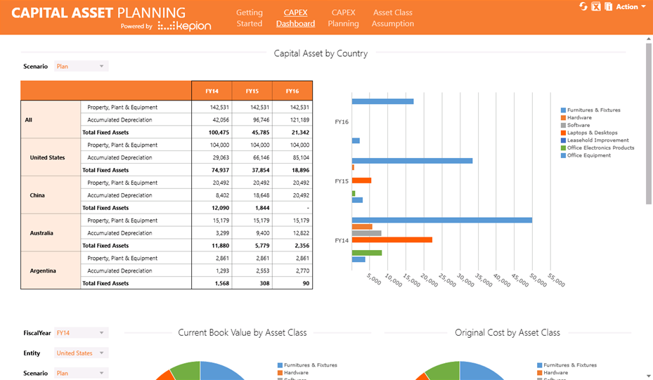
Lay out the forms vertically, and try to give all the forms full height so you won't need another vertical scrollbar within the Form. In that case you will get a page very similar to the webpage shown at the beginning of the article. On a small screen it will look like the one shown below:
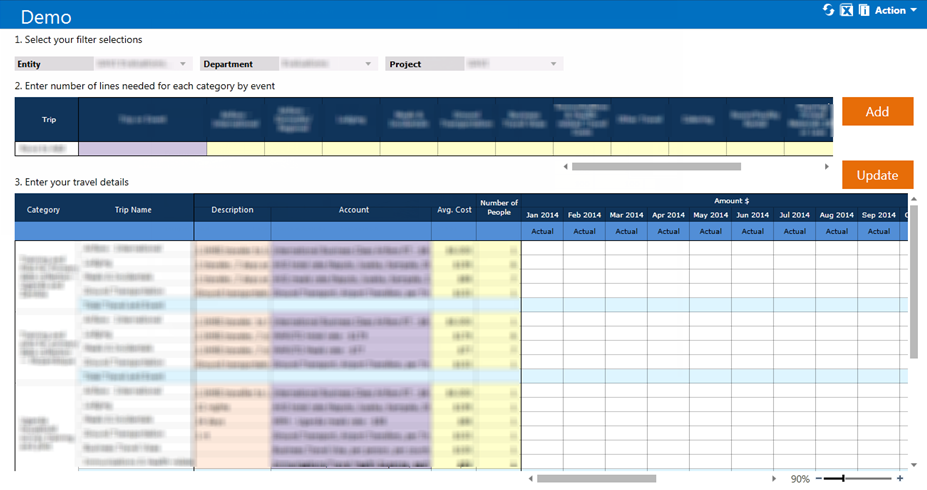
Another option for small screens is to avoid the page's vertical scroll-bar, and instead use the vertical scrollbar within each Form. This approach suits cases when the client site uses smaller screen, or when we have dynamic Forms which have the potential to grow big. Below is an example of a worst case scenario:
Lastly, we need to also consider the purpose and usage of each Dashboard, respectively. Users may tend to use planning Dashboards in the office where they have larger screens, while they may be accessing reporting Dashboards more often from their laptops. Remember, there's never a one-size-fits-all option when it comes to design, but hopefully these tips can help provide a good starting point.