Introduction
The Form Editor has 8 chart types you can use to visualize your data. These chart types include:
- Column
- Line
- Pie
- Bar
- Area
- Scatter
- Stacked Bar
- Stacked Column
Each chart can be fully formatted to achieve your desired look and feel.
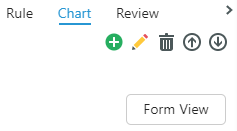
Create, Edit, and Remove Charts
1. Go to a Form in the Modeler and select the side tab.
2. Select Chart.
| Action | Function |
|---|---|
Add  |
Create a chart |
Edit  |
Adjust an existing chart |
Remove  |
Delete a chart |
Move up/down   |
Move charts up and down your chart list |
| Form View | Displays the underlying Form instead of the chart. Click on the chart in the side panel to see the chart again. |
3. Select .
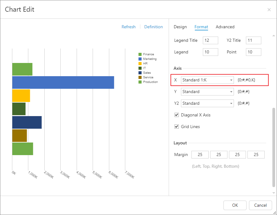
Design
The Design tab allows you to configure your chart's components. By default, charts are built using the Form's definition, not just selected cells. Edit the settings via the right panel and preview the changes via the left.

General
Type: Select your desired chart type (e.g., bar, pie, scatter, etc.).
Property: Adjusts how the Members are displayed by Dimension.
Data Source Option
Type: Since the HTML5 conversion, Dynamic is the only data type available. The chart uses the row and column definitions, so changing them in the Form will dynamically change the chart's contents.
Note: Although deprecated, Static charts you have made will remain the same. You cannot build new static charts, though.
Flip Axis: Reverses the current order of the axis definition within the MDX by placing row definition to column, and column definition to row. This feature is useful when using pie charts as they display the data using a single axis at a time.
Title
Allows users to give titles to the chart as a whole, each axis, and the legend.
Axis
Adjust the numeric ranges of the X and Y axes to appropriately scale the chart.
Format
The Format tab enables you to style the chart.

General
Palette: Select the data's color scheme.
Font Color: Select the text color.
Background: Select the background color.
Legend
Adjust the position and orientation of the legend, or even hide it if it's unnecessary.
Size
Customize the size of your chart's components.
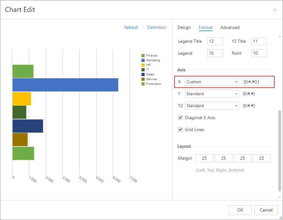
Axis
Change the axis scale (1:K or 1:M) or data type (% or currency), or create a custom format. You also have the ability to hide grid lines and diagonally tilt the Members on the X axis.
Below are examples of custom formats:
| Example | Description | Logical Value | Display Value |
|---|---|---|---|
| {0:#,#0,} | Display values in thousands, without showing the display units symbol "K". | 1,600,000,000 | 1,600,000 |
| {0:#,#0,,} | Display values in millions, without showing the display units symbol "M". | 1,600,000,000 | 1,600 |
| {0:#,#0,,,} | Display values in billions, without showing the display units symbol "B". | 1,600,000,000 | 2 |
Use the built-in Standard 1:K format to show values in thousands, with a "K" appended to the end of the display value.
Use a Custom format {0:#,#0,} to show values in thousands without showing "K".
Layout
Adjust the margin size.
Advanced
Series Override
Override your current display with alternative formatting. Series Override can be enabled only on column, line, and scatter charts.
Chart Display Settings
In terms of the chart display, column and line charts have additional options. Right-click a specific line or column to view the options.
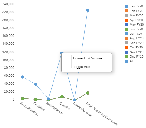
Convert to Columns (for line charts): Convert the selected line to a column.
Convert to Lines (for column charts): Convert the selected column to a line.
Toggle Axis: Add the Y2 axis to the right-end of the chart for the selected line/column. Use this option to create advanced charts with two Y-Axis.
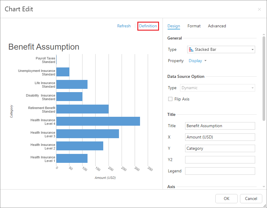
Definition
To view the chart's definition, click Definition. Its read-only, so you cannot edit it.
Example
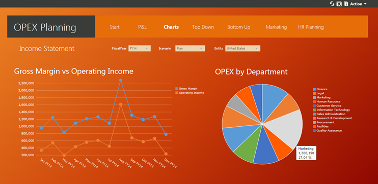
Here’s a sample of a Dashboard containing a few charts: