
Introduction
In part 6 of the Modeler Tutorial, we're going to gather and display all our Forms in one place. We want our end users to be able to switch between them, change Filter selections, and enter data. Users also need to see any changes to their Forms in real-time. Kepion can achieve all the above with a Dashboard.
Add a Dashboard
1. Navigate to the All Dashboards node and select Add.
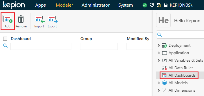
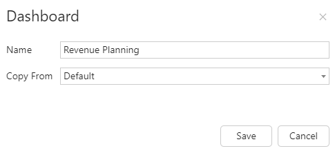
2. Name the Dashboard Revenue Planning.
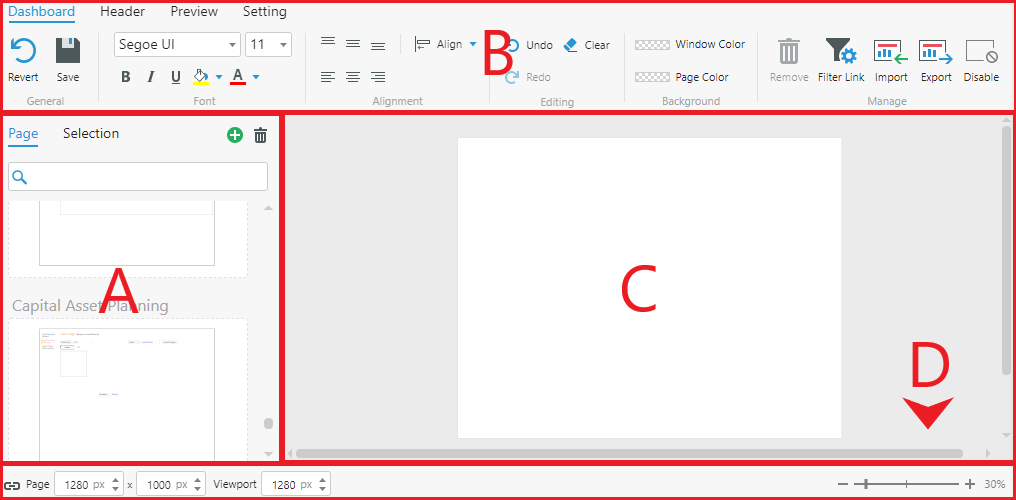
Inside, the Dashboard Editor will look similar to the example below. Let's break down the different sections:
A) A list of pages in the Dashboard. Each Dashboard Page can hold multiple Forms, Filters, text components, buttons, and more.
B) The various styling elements available in a Dashboard Page.
C) The Dashboard Page we're currently editing.
D) Page dimensions and zoom slider.
Configure a Dashboard Page
Let's add a Form to the Dashboard Page.
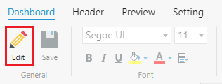
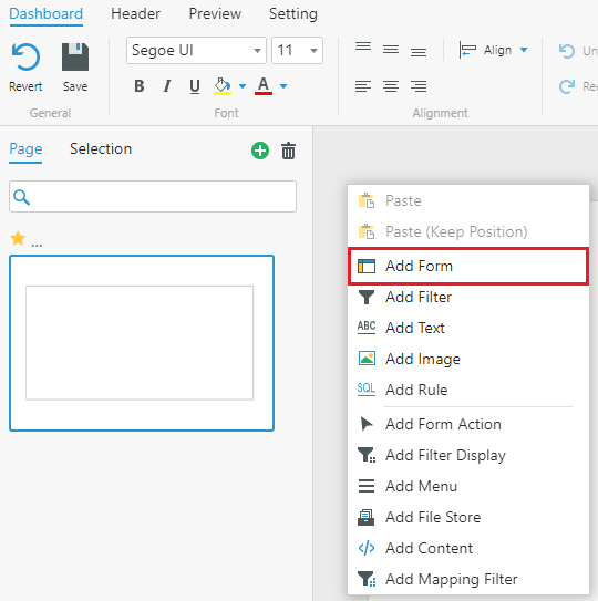
1. Select Edit to begin working in the Dashboard Editor.
2. Right-click anywhere on the workspace and select Add Form.
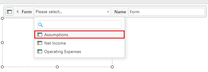
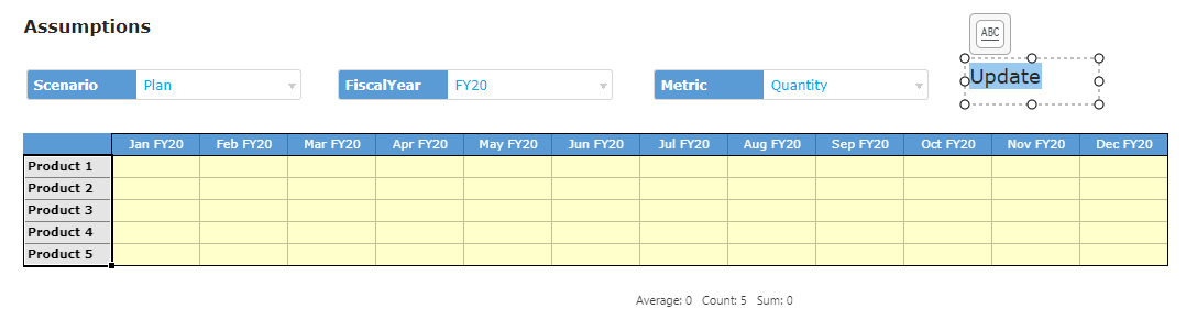
3. From the drop-down, select Assumptions as the displayed Form.
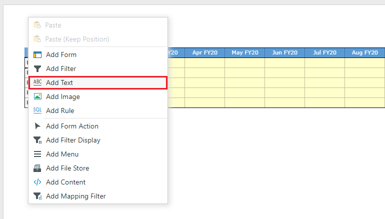
4. To add text, right-click any space off the Form and select Add Text.
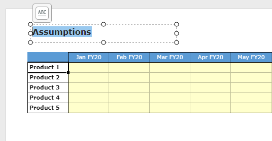
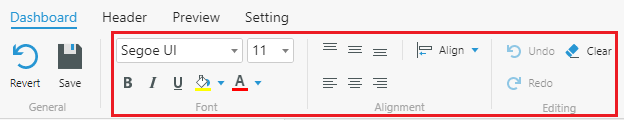
5. Enter Assumptions in the Text Component. You can style it however you choose, using the tools in the ribbon.
6. Right-click the page and select Add Filter.
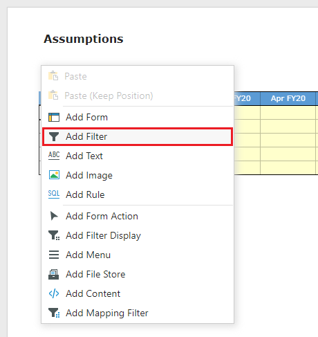
7. Select Assumptions for the Form and [Scenario].[Scenario] for the Filter.
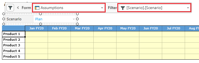
8. Copy and paste the Filter twice.
9. Configure the Filters with the FiscalYear and Metric Dimensions.
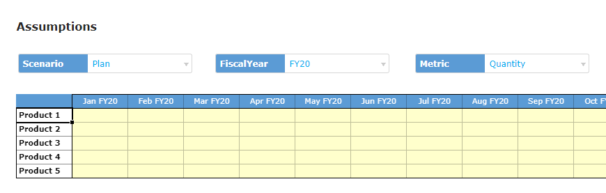
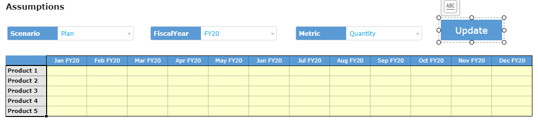
We can then style the Filters to create a cohesive theme.
Configure Buttons
In order to submit data from the Dashboard to the server, we need to use a Workflow Action called Post.
1. Right-click the workspace and select Add Text.
2. Enter Update in the component.
3. Use the ribbon tools to style the component as a button.
Note: In a published App, Workflow Actions are also available from the ACTION drop-down on the right side of the header. However, well-designed buttons tend to improve the user experience.
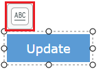
3. Click on the text settings icon  . Here we can change the Text Component into an interactable element.
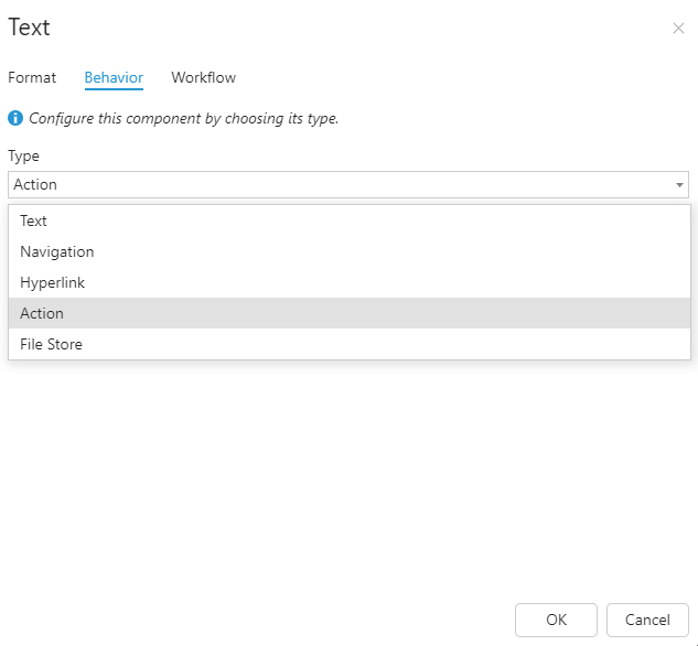
4. Go to the Behavior tab and configure as follows:
- For Type, select Action.
- For Action, select Post.
When someone clicks on this Text Component, it will trigger the Post Action and upload the inputted data to the database.
5. Select OK.
Create Additional Pages
We don't want to overcrowd one page with too much information or too many Forms, so let's create new pages.
1. Right-click the page in the left pane and select Copy.
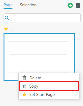
Copying will save us time configuring the page and its components. If you want or need to create a fresh page, select  .
.
Tip: The star icon next to the page name indicates the landing or start page. You can change this by right-clicking and selecting Set Start Page.
2. In your new page, change the page title to Operating Expenses.
3. Select the Form and change it to Operating Expenses.
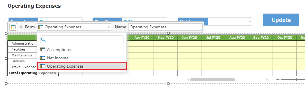
4. Delete the Metric Filter.
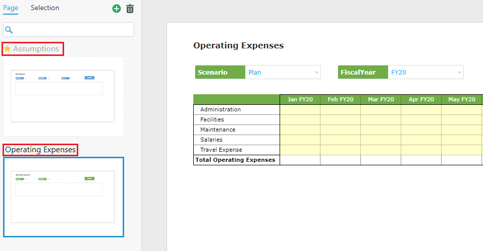
5. Click above the preview of a page to change page names. Enter Assumptions for the first page, and Operating Expenses for the second.
(Optional) Change the Filter and button styling if necessary.
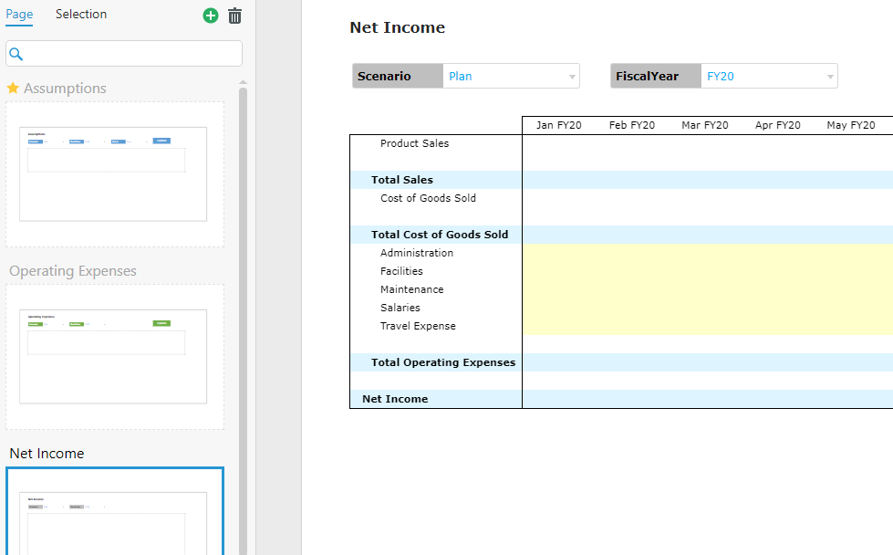
6. Right-click either page in the left-pane and select Copy.
7. Repeat steps 2 to 5, except configure the page for Net Income.
Configure the Header
1. Go to the Header tab.
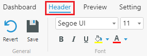
The Header refers to a static section at the top of our Dashboard. Users will use it to navigate between pages. Our Header is looking cramped, so let's change its formatting.
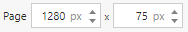
2. To adjust the size of the whole Header, change the Page settings in the bottom-left of the window.
3. To adjust the page list, select it and change the Top Border, Left Border, and Size options in the bottom-right.

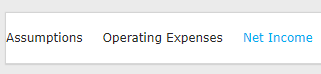
Here's an example post-adjustment:
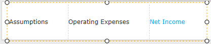
4. To style the navigation menu, select the page list, click the Mode drop-down and then Selected.
5. Click each menu item to begin styling for when its selected.
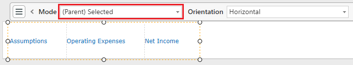
Tip: You can hold Shift or Ctrl to select multiple items at the same time.
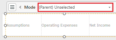
6. Switch the Mode to Unselected, style the menu items for they're not selected.
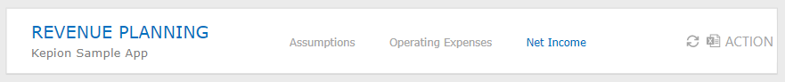
7. Right-click the workspace and select Add Text.
8. Enter Revenue Planning as the title of the Dashboard.
Here's a completed example:
9. In the Setting tab, select Set Image to choose an icon for the App. You will see it when the Dashboard is displayed in the Apps module.
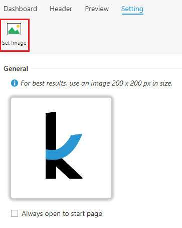
Tip: If you do not select the Always open to start page option, the App will open on the last page you used.
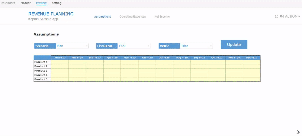
10. Go to the Preview tab to view the final result:
Next Steps
Now that our Dashboard is finished, we can move on to Part 7 - Administrator Settings to configure a few additional permissions and administrative settings.