
Introduction
Users can customize Dashboard Filters in numerous ways to achieve optimal functionality, look, and feel. In this article, we will walk you through how you can configure your Dashboard Filters to meet your needs.
Settings
The Settings tab focuses on the Filter window (i.e., the display to select a desired Member or group).
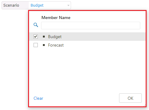
You can view the Filter window in the left pane to preview any changes made.
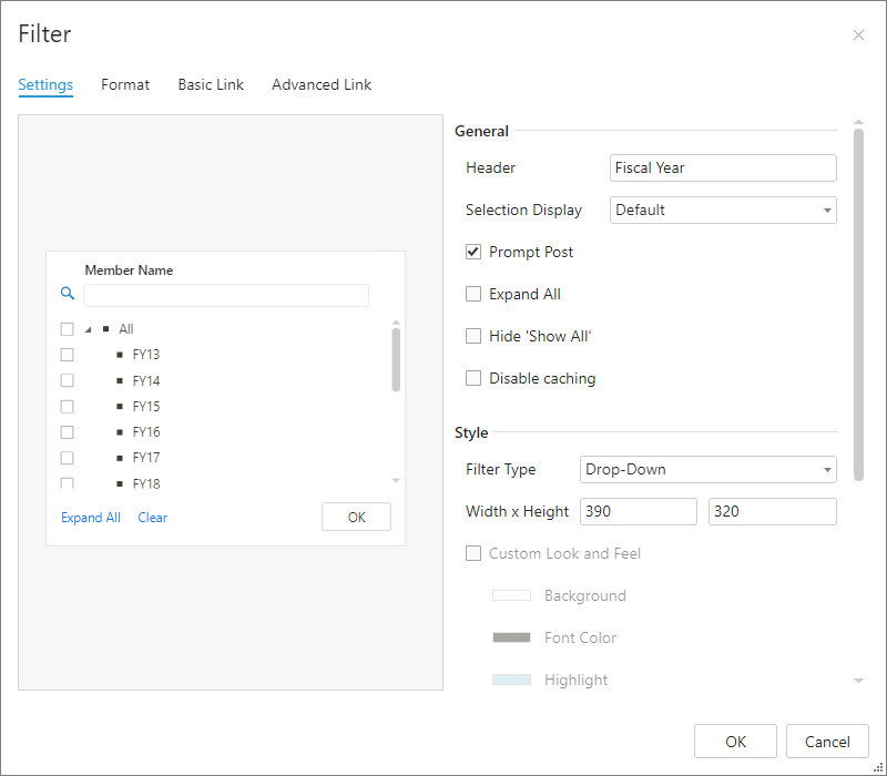
General
| Option | Function |
|---|---|
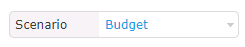
| Header | Enter the name for the Filter |
| Selection Display | Display Selection by chosen Attribute |
| Prompt Post | If enabled, users will be prompted to post their changes to the data, before changing the filter selection. |
| Expand All | If enabled, the Member List will be expanded upon clicking the Filter. If disabled, the Member List will be collapsed (apart from the group that contains the selected Member) |
| Hide 'Show All' | Hides the Show All option |
| Disable Caching | Caching allows Kepion to serve data faster. Check the option if you do NOT want Kepion to cache your Filter selections. |
Style
| Option | Function |
|---|---|
| Filter Type | How the selection menu appears. Either as a Drop-Down from the Filter or a Pop-Up window. |
| Width x Height | Customize the Filter window's size. |
| Custom Look and Feel | Customize the colors of the Filter window. |
| Link Style | If enabled, this filter will share formatting settings with all other filters that have Link Style enabled. |
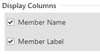
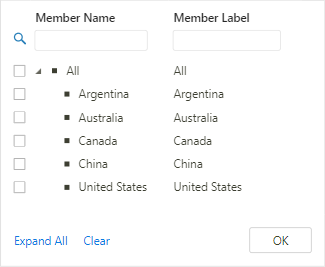
Display Columns
Select the Attribute columns you want displayed in the Filter window.
Format
The Format tab primarily enables you to customize a Filter.
General
| Option | Filter |
|---|---|
| Width x Height | Customize the Filter size |
| Border Thickness | Customize the thickness of each side of the Filter (top, right, left, and bottom) |
| Corner Radius | Customize the radius of the Filter's corners |
| Border Color | Select a color for the Filter's border |
Header and Selection Style
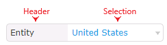
A Filter is comprised of two parts: the Header and Selection. The Header Style and Selection Style sections allow you to configure the look and feel of each part. You can change the font, text alignment, colors, etc.
Bulk Format
On Save: Select whether you want to Apply format to this component only or Apply format to all components of the same kind.
Exclude Bulk Format: If you are using bulk formatting, you can use this option to give specific components unique styling and/or formatting.
Basic Link
The Basic Link tab allows you to link the current Filter with other Forms. You must be using the Filter in the Form to establish the link.
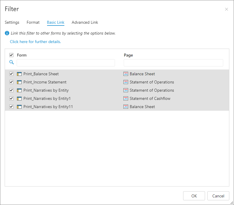
Tip: Refer to our Manage Dashboard Filters article to learn how to configure Filter links.
Advanced Link
The Advanced Link tab allows you to create links between Filters that do not come from the same Dimension. Filters for type hierarchies can be linked together using this feature. In addition, Filters that have Member properties associated with them, such as Member-List and Parent-Child Hierarchies, can link to other Filters using their properties/attributes.
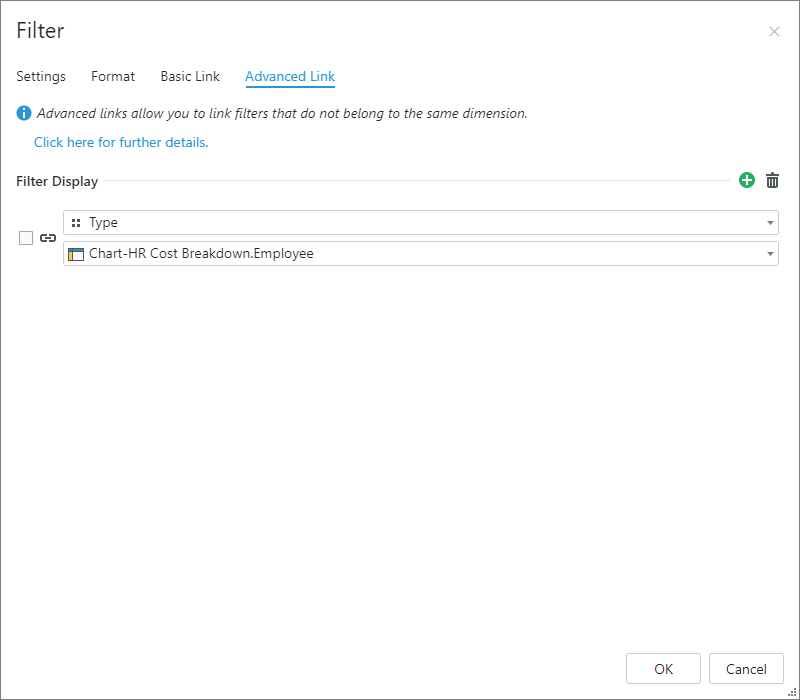
Tip: Refer to our Manage Dashboard Filters article to learn how to configure Filter links.